I hope Week 1 was easy on everyone. Generally, you can plan on new posts for the group in Sunday night, around this time. I promise, I won't be posting as much as last week ;-)
I would like to give everyone a round of applause for getting your details to me and getting set up in our numerous technology tools. I know it's a big 'upskilling' for many of you, but now you have all term to work out the kinks and explore. Remember, you can click on any Google Doc to request access, if I have not already given you permission to edit and view.
We have F2F this week, on Tuesday @11am in the CRC-Fishbowl. This is mandatory for all international students, and optional for everyone else. So we don't go too long with a chat, for those who cannot attend on Tuesday morning, I'll be offering an additional chat that evening (Tuesday, August 2nd @830pm). In both meetings we'll go over details about the course, as well as Assignment 1.
For this week, you should be working on:
1) Developing your blog (e.g. possibly experiment with adding a Feed, so I can follow you easier; adding permissions)
2) Responding to a minimum of 2 other students' blogs (see Activity 1)... Note - it's good online etiquette to respond to some of the comments you might receive on your blog
3) Working on Assignment 1.
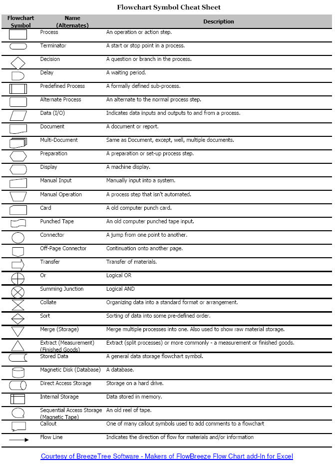
Now, in regard to Assignment 1. I thought an interesting point in the Patti Maes video was the idea of 'standard gestures', such as taking a picture or enlarging a digital map. When did these become standard? How do we know if a gesture or image or idea has been standardized. For example, how do you ask the check or bill in a restaurant? Do you make a little check sign in the air or do you scribble on your hand as though writing a bill? Check out this new technology based on standard gestures. If you have ever worked with flowcharts, you may know that there are standard symbols for certain processes.
Here are two links I put in the subject Diigo:
1) http://www.wired.com/gadgetlab/2008/10/post
2) http://www.feedthehead.net/
Both of these sources deal in symbols. The first is obviously quite explicit, while the second is less so. You'll probably find the first easy to interpret (possibly it will make you go into a fit of laughter, as I did). Consider, if you lived outside of the developed western world, would it be as easy? Would you recognize all the symbols and the cultural meaning loaded into each? Think about this in terms of Assignment 1. When we are not able to verbally explain what we mean, what can we use? Now, when/if you looked at the second link, what did you do? When you found the little hidden bits and bobs, what did you do? Did the choice of shapes and symbols cause you to make certain moves? Are these images as culturally loaded as the logos? Are they universal or at least closer?
What I am talking about is how you expect your user or viewer to interact with the object or tool you have created. Check out the following source (specifically the introduction) for an excellent description of the human-computer interaction:
Raskin, J. (2000). The humane interface: new directions for designing interactive systems: Addison-Wesley Professional.
Keep these things in mind as you move through the web, and you think about developing Assignment 1.
Have fun!
Sarah
No, to be honest I haven't found the first week 'too easy' ...it has definitely been an up-hill learning curve - technologically speaking! At the same time I recognise it is an important learning curve re learning skills that will be relevent to teaching students.I have to say that I'm not really completely sure what you mean by adding a 'Feed' let alone knowing how to do it! Pleased to see you have allocated an evening chat time for Tuesday nights because, as a classroom teacher it would be impossible to access the day time one you set up initially- how do we access these 'chats'?...none of my previous on-line subjects have had them.
ReplyDeleteHi to all!!!
ReplyDeleteI agree with Sally, some things I found easy to do and creating a blog was O'Kay. But it took me half an hour how to setup permissions and then how to invite people to join my blog. I have also inadvertently not accepted other students invitations to join their blog as I wasn't logged into Google at the time! But it has been a great learning curve to be on and I am enjoying the challenge of working it out as I go! How did everyone else go!?!?
Sally, I wrote something of a tutorial to add an RSS feed to your blog.
ReplyDeleteIt's at http://edge903graham.blogspot.com
A few people had asked how to do it, so anyone can see it here. I hope it helps.
Sally, I definately agree with you. I have found some of the tasks quite difficult. I also though that I was quite tech savvy until I started my Masters and realised how far behind I was. I dont know about any of you but when I checked out the US senators and the symbols I had no idea what they were trying to represent. Are they saying that Obama is more tech savvy then other senators?
ReplyDeleteHello all! As I said before, yes it is a steep learning curve, but you're all doing great. Not to worry at all. As far as the symbols and their relation to the politicians has to do with the hierarchy of technology and it's 'current-ness'... or it's relevance and position in the technology world - in relation to the current and relevant position of the politicians. For example, the iPhone is more 'current' and 'hip' than the Blackberry, which is more corporate (therefore, less hip). Have another look at the article with this in mind.
ReplyDelete